The Archive: Mobile Notes App Prototype

The Archive: Mobile Phone Notes App Prototype

UI/UX Design | Competitive Analysis | Wireframing | Prototyping

Project Details

arrow icons for navigating between local navigation sections


This project was undertaken during my MDIA 2330 UI/UX Prototyping course at BCIT. For this project, I was required to develop a mobile app prototype using the Adobe XD platform. The project required developing a low-fidelity wireframe, translating it into a functional prototype, and documenting the process in a detailed report.

The primary objective was to design a polished prototype that met specific project requirements. The app had to include various design elements such as scrolling (vertical and horizontal), repeat grids, and reusable components. I was particularly proud of this project because before this course I had no background in prototyping. This project showcases my ability to not only learn how to create a prototype in Adobe XD, but also apply design principles.

I chose to make a prototype mobile notes app called "The Archive." As someone who makes extensive use of notes apps, I wanted to try and create a basic - yet functional - prototype with a retro feel.

Project Type: UI Prototype
Website Version: Mobile app
Course: UI/UX Prototyping, BCIT (MDIA 2330)
Date Completed: February 5, 2023
Team or Individual project: Individual
My Role: Conceptualized and developed prototypes

Design Process

arrow icons for navigating between local navigation sectionsarrow icons for navigating between local navigation sections


In developing “The Archive” mobile notes app prototype, I followed a structured design process to ensure a polished and functional result. This process included several key stages:

  1. Brainstorming
  2. Research
  3. Wireframing
  4. Gathering artifacts
  5. Prototyping

Each step was integral to achieving the project’s objectives and refining my skills in UI/UX design.

1. Brainstorm

arrow icons for navigating between local navigation sectionsarrow icons for navigating between local navigation sections

Screenshot of a brainstorm outlining all the features for the notes app prototype

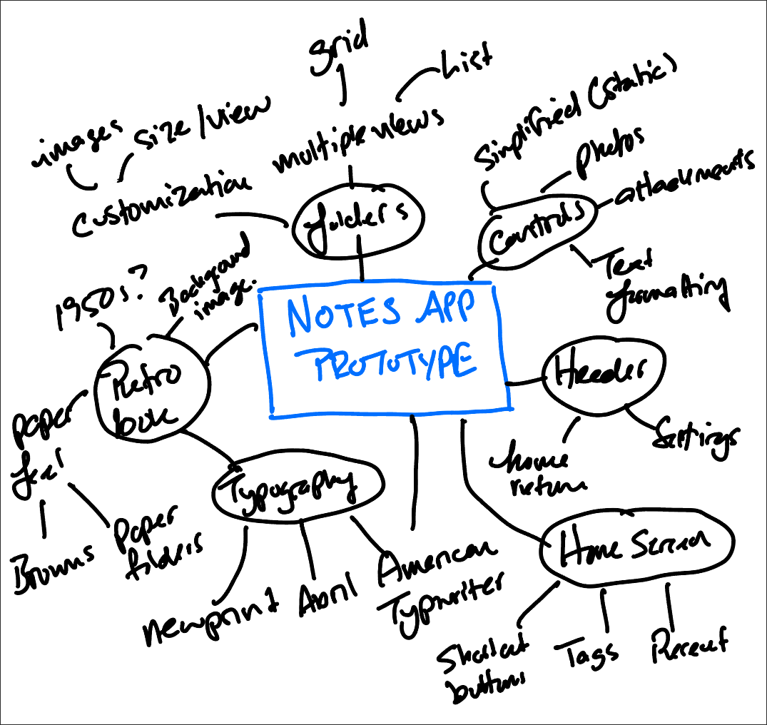
Prototype Brainstorm

The brainstorming phase was crucial as it laid the foundation for the project. It allowed me to explore different ideas and concepts, helping to identify key features and design elements that would be essential for the final prototype.

Using an iPad application called Notability, I created a mind map outlining all the features I might want to showcase in a prototype. The goal was to brainstorm as many features and design elements as possible for a notes app prototype.

Why this strategy?

The brainstorming phase helped me generate a wide range of ideas and features without constraints. This free-flowing ideation ensured that all potential functionalities were considered before narrowing down to the most effective ones. It also helped in visualizing the project’s scope and setting the direction for subsequent phases.

2. Research

arrow icons for navigating between local navigation sectionsarrow icons for navigating between local navigation sections


Next, I reviewed various note-taking apps, analyzing their features, layouts, and user interfaces. I made note of the layouts that are commonly used, as well as iconography and features. This research provided valuable insights into effective design practices and user experience enhancements, guiding the design of my prototype.

Why this strategy?

Conducting thorough research allowed me to understand industry standards and user expectations. By analyzing existing successful apps, I could identify best practices and avoid common pitfalls. This research was essential for creating a prototype that not only looked good but also provided a seamless user experience.

Below are some common design trends I noticed after surveying a variety of note apps.

  • All the apps allow the user to store and retrieve notes by navigating through a folder structure.
  • Some note apps (namely Apple Notes and Notion) have a "splash page," in addition to browsable folders, which allows users to access recent notes or access tags from their notes.
  • Apps incorporate controls that are always present that allow the user to get back to another folder or search for notes.
  • When composing or editing a note, all the note apps have a similar editing menu that allows the user to select different fonts and formatting options, attach documents or photos, or share the note with other users.

Design Goals

Using the information from my brainstorming activity and research of other note apps, I developed several goals that I wanted to achieve for my design. These choices reflected both the app style I wanted to convey as well as essential features for a notes app.

  • Retro look and feel: Most of the popular note apps are sleek and have a very modern feel. To differentiate my prototype, I wanted to develop an app that had a vintage 1950s military look and feel. I wanted the app's background to remind the user of physical folders, and I wanted the typography to reflect that of a typewriter.
  • Full-featured splash page: I wanted the app to have familiar controls for users coming from another application. But, I wanted the app to include a home/splash page that gave the user a variety of navigation options without having to user the standard controls in the header or footer.
  • Folder images: Notes app folders are functional but not very customizable. I wanted to design a prototype that allowed the user to customize folders with images.
  • Multiple views: I like that many existing notes apps allow the user to switch between list and grid views. I wanted to incorporate grid views and horizontal scrolling and have notes that resemble thumbnails.

3. Wireframing

arrow icons for navigating between local navigation sectionsarrow icons for navigating between local navigation sections


Low-Fidelity Wireframes

Creating hand-drawn low-fidelity wireframes was an important step in visualizing ideas quickly. Prior to this project, I had never done any wireframing or prototyping. This initial planning helped in organizing elements and iterating designs before moving to digital tools, ensuring a well-thought-out structure for the prototype.

I used these wireframes to plan out the application frames I wanted to prototype in Adobe XD. While there could be many different examples I could have prototyped, I developed frames for the following:

  • Login page: Where the user would log into their account
  • Home/splash screen: This page would feature vertical scrolling and would have buttons that allow the user to quickly jump to different sections of the app.
  • Notes folders list view: This frame would showcase vertical scrolling
  • Notes folders grid view: This frame would showcase horizontal scrolling and would show how the user might change the folder layout for their notes.
  • Two example notes: These frames should include horizontal scrolling, embedded images, and an embedded scrolling map.

Why this strategy?

Wireframing enabled me to outline the basic structure and layout of the app without getting bogged down by details. This step was crucial for planning the user interface and flow, making it easier to make changes and improvements early in the design process. It also served as a blueprint for the digital prototype.

Screenshot of a low-fidelity wireframes done on lined paper

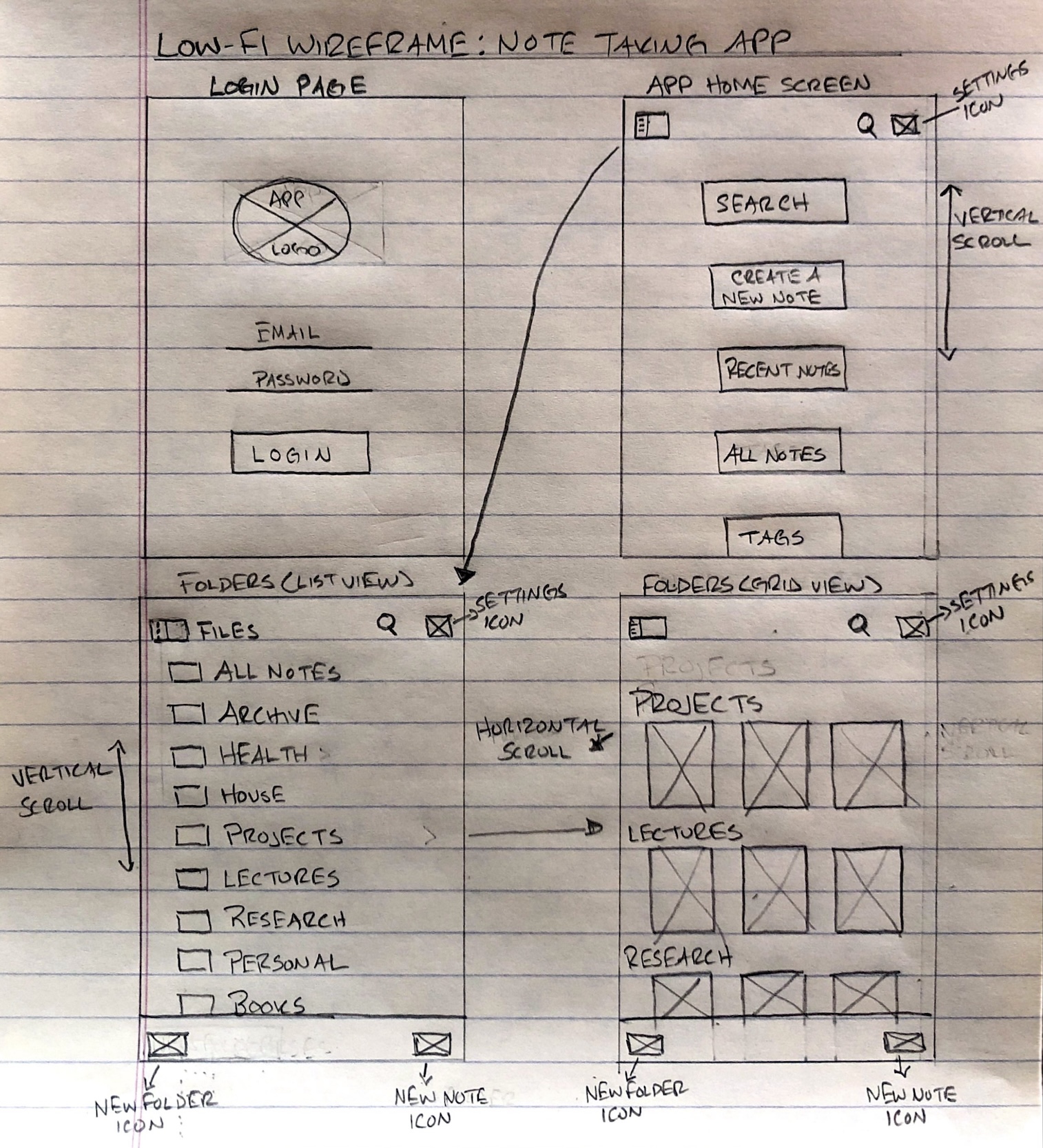
Low-Fidelity Wireframes: Login Page, Home Screen, Folders List View, Folders Grid View

Screenshot of a low-fidelity wireframes done on lined paper

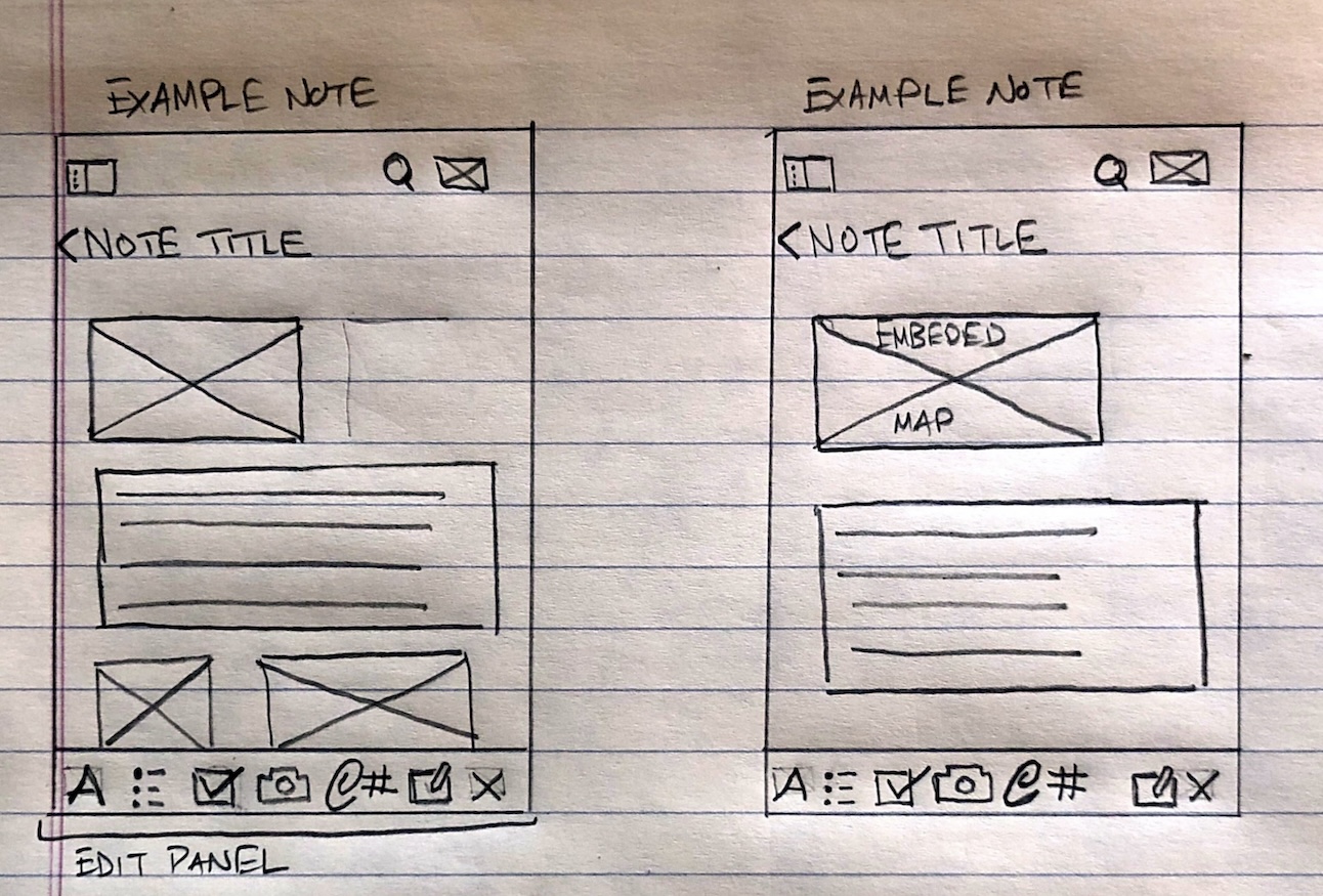
Low-Fidelity Wireframes: Individual Notes

4. Gathering Artifacts

arrow icons for navigating between local navigation sectionsarrow icons for navigating between local navigation sections


Using my experience from working with open educational resources, I focused on gathering openly licensed images and icons from resources such as Pixabay, Pexels, and Wikimedia Commons to ensure legal compliance while enhancing the visual appeal of the prototype. Selecting resources that aligned with the overall design theme added to the prototype's professional look.

Why this strategy?

Gathering artifacts from open resources ensured that the prototype was both legally compliant and visually appealing. This approach not only saved time and resources but also aligned with the project’s goal of creating a professional-looking app with a cohesive design theme.

5. Prototyping

arrow icons for navigating between local navigation sectionsarrow icons for navigating between local navigation sections


This project was my first experience developing a prototype and using Adobe XD. I learned to create elements as outlined in the project requirements, including 4-6 views, vertical and horizontal scrolling elements, repeat grids with images, shape masking for images, and reusable components used in multiple places. I learned how to use the grid layout feature for consistent edges, headers, and footers. Additionally, I developed scrolling elements (vertical and horizontal) and used the iPhone 13 Plus artboard size for a consistent design.

I also gained a greater appreciation for keeping elements organized within a design application like XD. A big factor in streamlining the development of these designs was sticking to a consistent naming convention for elements (particularly icons and images) and keeping track of common image sizes. Initially, I attempted to manually resize icons, but I noticed that the icons were inconsistent. For this project, I documented standard icon sizes, colour hex codes, and file naming conventions. Doing this greatly streamlined the development of subsequent prototype frames.

Why this strategy?

Prototyping in Adobe XD allowed me to bring the wireframes to life, adding interactive elements and refining the visual design. This hands-on experience with the tool was invaluable for understanding the intricacies of creating a functional app prototype. It also helped me learn how to organize elements systematically and maintain design consistency across the prototype.

Screenshot of the XD project for The Archive prototype. The screenshot shows the level of organization of the elements used.

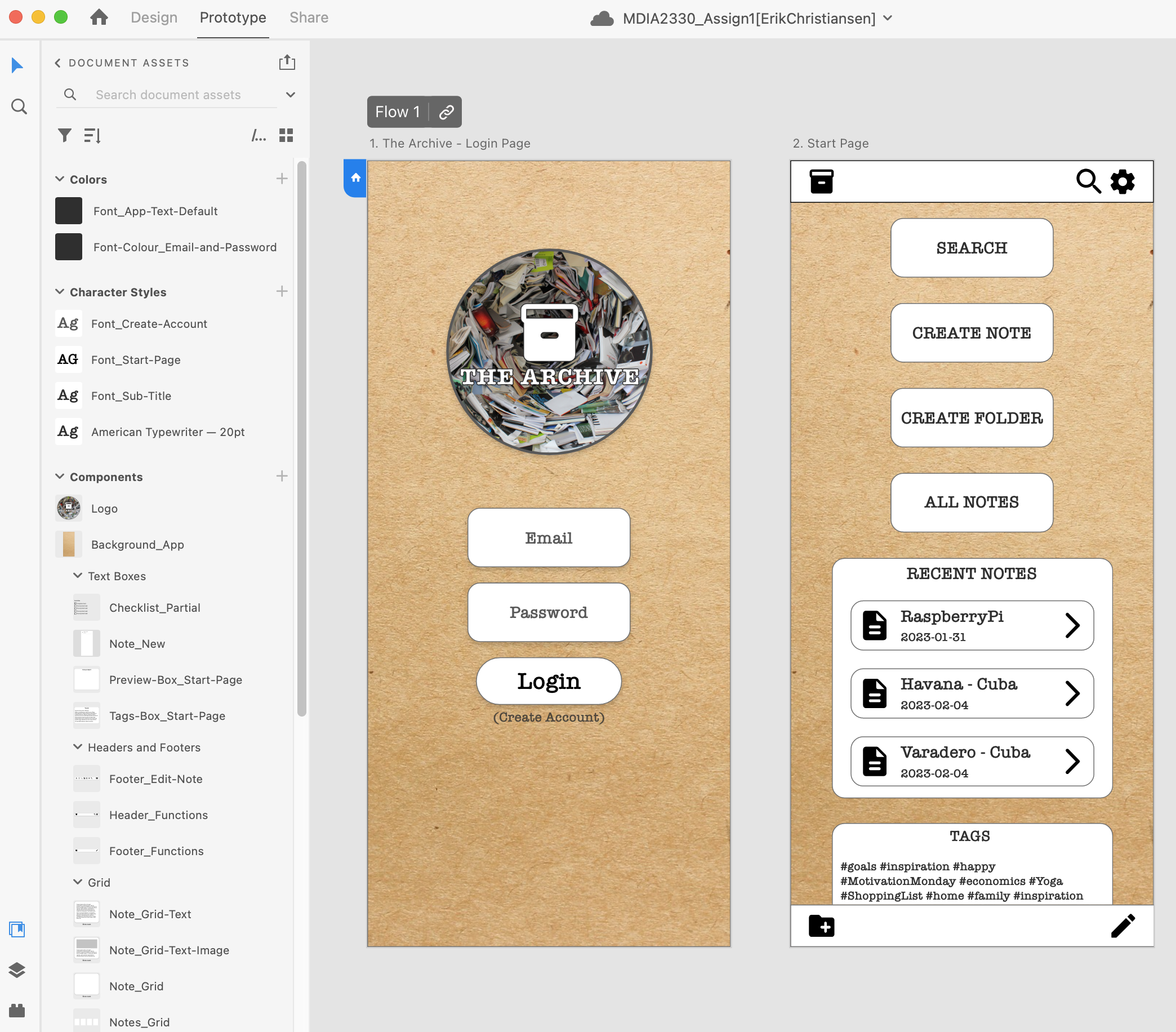
Example of Adobe XD Project Components and Standards

Screenshots of Final Prototypes

The final prototypes can be viewed using the embedded flipbook on this page, or you can download the PDF document. These screenshots showcase The Archive's seven frames created in Adobe XD - including the login page, home/splash page, folders page in list view, folder page in grid view, and two examples of what individual notes would look like.

Throughout these prototypes, there are the following

  • Consistent header controls: Return to homescreen (archival box), search, and settings.
  • Consistent footer: Create a new folder (left) or create a new note (right)
  • Controls for text formatting and adding attachments for the two example notes (Havana and Raspberry Pi)

Video of Prototype Features

To better explain the prototype's features and design considerations, see the video screencast. This video showcases the following:

  • Vertical scrolling
  • Horizontal scrolling
  • Multi-directional scrolling (map example)
  • Embedded images
  • Different notes folder views


Reflection

arrow icons for navigating between local navigation sections


Throughout this project, I had to consider various design elements, such as determining which menu items should persist across pages and when they should change. This process underscored the importance of consistency and adaptability in design. I developed a deeper understanding of aesthetic layout and symmetry, which are crucial for creating a visually appealing prototype.

As I progressed, I felt much more confident in creating and implementing a structured design process. I gained a newfound appreciation for maintaining design consistency - ensuring that icons, colours, and file naming conventions remained uniform throughout the project.

Initially, my progress was inefficient, but as I became more familiar with grouping elements in Adobe XD and creating reusable components, my proficiency improved significantly. By the end of the project, I felt very comfortable working with the XD program.

Additionally, I developed a greater appreciation for thinking through user flow, a skill that would prove invaluable in later courses at BCIT. Mapping out where a user would click to navigate to the next frame was challenging but enlightening. This project highlighted the importance of not only prototyping but also researching to determine the best layout and structure for an application.

References

See the Resources page for a list of images and sources used in this project.

Comments are closed.